55 South
Art Direction | Branding | Print | Drone Operating | Video

Fifty Five South is a luxury furniture and home interiors brand from Premier Housewares, my employer before I went freelance. Suppling to the retail and interiors industries, the brand showcases many curated collections, classic and opulent in nature but diverse in style.
I was asked to a create the branding while I was Senior Graphic Designer. The solution needed to lean into the luxurious and classic traits the majority of the product lines had, while also catering to the more contemporary and Scandinavian collections.
This led me explore a number of brand marks in the style of a traditional monogram. I used an audience testing service to determine which mark resonated the most with our target audience.
The final branding features an elaborate mark but in a clean and minimal black and white palette. Using photography of interiors and rich textures to link opulence with the 55S mark in the minds of the viewers.
Images copyright Premier Housewares LTD.


The colour palette present in Fifty Five South's print and online content is minimal as the focus is set on the interiors photography. Black and white are used in the branding as they act as a neutral but consistent backdrop to a diverse range of interior design.
Gold or copper foils give an accent to print materials when it compliments the setting within the photography.
A light grey and several pale hues give a backdrop to product images and highlights to header text.


Below are excerpts catalogues intended for interior designers and trade buyers. They contain approximately 5,000 products and work from a dozen or so talented former colleagues of mine, in the form of copy, photography and visual merchandising.
As Senior Graphic Designer, I had the responsibility of art directing and project managing these catalogues; coordinating and collaborating with the buyers, stylists, photographers, copyrighters, and my own team of graphic designers.
I created templates for layouts and room for initiative in the artworking of each page, yet this would still be a mammoth task for a team of five designers to handle.
The answer was to create a workflow that would involve automating the importing of data and images above of what you would expect from InDesign's 'data-merge' feature. This meant creating a modular template that would be populated by the designers selecting the most suitable option to present a product on a case-by-case basis. These 'options' where generated for each product, allowing for them to leave the data importing and typesetting to automation while still having a thoughtfully presented journey through the products. One that allows for giving more emphasis to certain products, minimising the colour variants next to them, or just giving more space to an item to show an additional image that demonstrated a feature of the item.
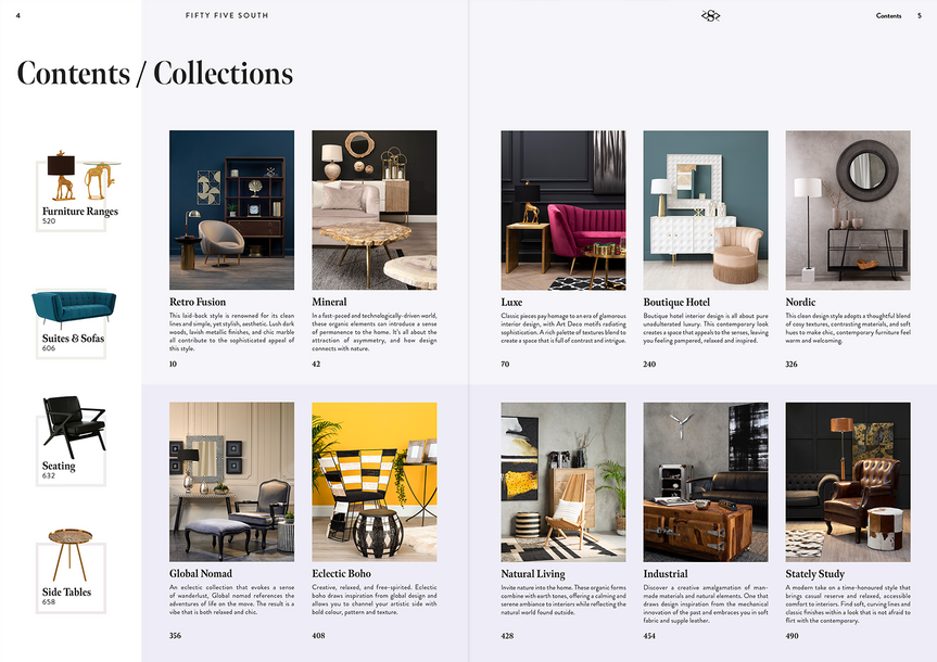
Collection Pages
The collection pages are magazine-like spreads that precede the product listings.
Product Listing Pages
Within this workflow I had developed, I also came up with a way to automate clickable links with active areas that cover the whole image and text, for all 5,000+ items. Below you'll see a a quick demo of how you can browse the downloadable PDF version.


Since 2016 I've flown drones and used the footage I captured on trips to learn editing, post production and colour grading.
While working for Premier Housewares I saw an opportunity to promote a new showroom by capturing footage with my as though we had a dolly and crane set-up you would expect to find on a film set.
A looped edit of the footage was played on portrait display screens at trade fairs. I repurposed the video into a number of Instagram stories.
Showroom Stories
Brand Stories

Thanks for viewing!
Follow me for more:


